My First Obsession
Before I started learning Unity & broader game development I studied 3D art & animation. While a capable artist, I spent most of my time rigging, animating & focusing on the more technical side of 3D art. Once I completed my degree I dived straight into Unity, trying to make something of my characters & animations.
Feel is everything. What looks good in Max or Blender doesn’t necessarily feel good to play. Starting out I tried to create hundreds of transitions to make everything flow perfectly into the next animation. This ballooned the animation budget & left the state machines a mess of transitions. As I improved I started to remove transition animations & hide transitions behind quick & snappy motions.
Eventually, combat led to runtime inverse kinematic programming, pathfinding, ai, and procedural generation. I grew so enamored with programming that I left combat largely behind. 4 years & many failed prototypes later I came back to combat & built this prototype. Taking what I’d learned, I built something simple & low-scope with feel as the core focus.
Goals
Fast Arcady Feel
Feel is everything. While I can appreciate the beautiful complex, flowing combat of games like Assassin’s Creed & Shadow of Mordor, they strip control away from the player. This can leave the combat feeling floaty & unimpactful. A beautiful show, but feeling pretty dull to play.
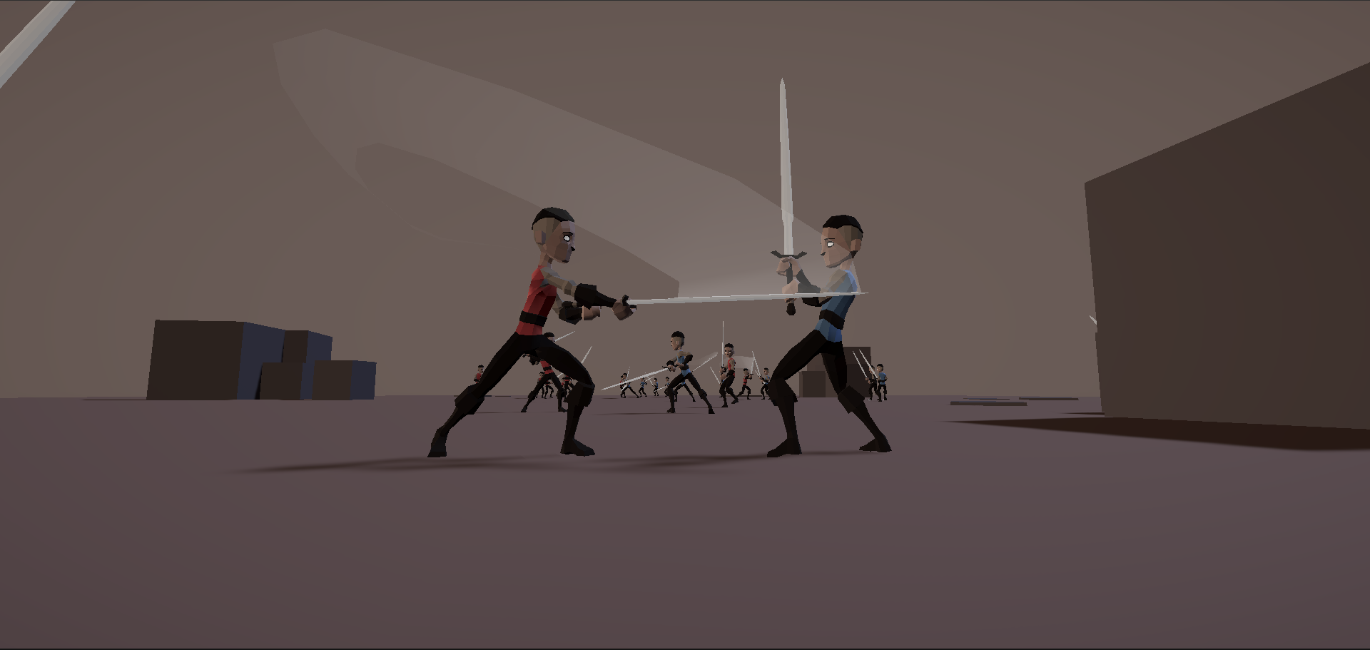
Instead, I focused on quick simple animations & large obvious movements to telegraph attacks. Having players zip around the screen covers up animation transitions & lends a sense of speed & excitement.
Positioning & Commitment
Every choice you make should have consequences. For this game, I largely based the combat & AI around positioning. To attack an enemy is to commit to moving closer to them. The closer you are, the less distance they have to cover & the quicker they can counter-attack.
This encourages the player to dodge past attacks, instead of away from them. A higher risk, but increasing the odds you’ll land a successful counter-stroke.
Conversely, If you miss, you give your enemy an opening. So it becomes a fast-paced dance of attacking, dodging & counter-attacking.
Minimal UX
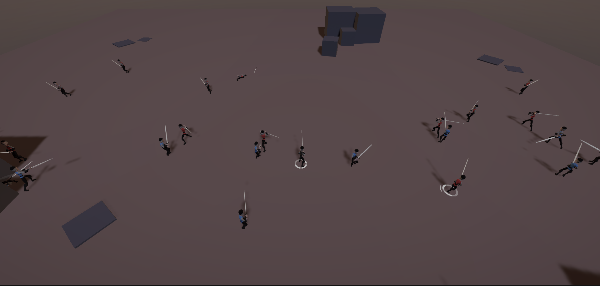
This style of combat requires constant focus & attention. It’s quick & any slip-up will cost you. To accommodate this, I positioned the player & enemy unit’s health pips at their feet. This keeps the player’s attention on their avatar & enemies, instead of making them look to the corner of the screen to check their health.
This style of UI falls apart when the terrain is uneven though. This was the impetus that led to the development of Dynamic Decals.
Try It!
I recommend starting with the Ambush scenario. Press Tab to restart & select a new scenario afterward.


